Storybook for react - a good long term solution
Written by Sónia Marques
Hi! If you’re a frontend developer and check the boxes below, then this read will be a worth your time.
Interested in component driven development.
Want to improve the communication between software and design teams.
Value design consistency across your multiple frontend projects.
Think DRY principle is the way to good and developing the same input elements for each project is silly.
Recently our software team started working on building our own user interface (UI) framework using Storybook for React. Although this project is still in its early stages, it is already in use on the new web app we are working on.
LET’S DO AN OVERVIEW OF WHAT IS STORYBOOK:
Storybook is a UI component development tool that allows you to build isolated components while the storybook setup takes care of their organization and visualization.

Fig.1 - Adapttech’s Storybook project
You can then locally pack it as a module or use npm registry to publish it, and you’ll be able to import your components to any frontend project you work on (as long as it has the same published target).
With this tool you are able to develop each piece of your interface and continue to integrate them in more complex components until you find best to move them to your frontend projects.
Your design and software team can work together to decide what is going to be reused - that is, what should be incorporated in the storybook project - and what is a ‘single use’ element that can be defined in its specific frontend project. Besides that you can also collaborate in code/component review during the development process.
The perks we found of working and maintaining the company’s own UI framework with Storybook are the following:
Allows total focus on each component, promoting a more detailed analysis and centralized manual/visual and automated testing.
Reduces developing time in future frontend projects.
Promotes consistent design, which is generally favorable for a company’s brand.
Offers a simple way to display the features of the individual components to people outside of the software team - design and management being particularly relevant.
Works also as a great documentation tool, which improves the developer experience for those implementing the framework.
Allows full freedom to define the methodology used to organize components in the way that better suits your company’s needs.
Makes maintenance more straightforward - the changes done in the UI framework will propagate by simply updating the module in the different projects.
Prevents you from getting stuck on someone else’s decisions: extend and grow your components overtime with full flexibility.
OVERCOMING THE DRAWBACK:
The title of this blog post gives a hint of one of the factors that need to be taken into account when pondering the start of a UI framework: time. Building a UI framework demands quite some time and work, but if done right, it will surely pay off the investment in future frontend projects. In the long run, your team will be able to more quickly deliver better quality and more robust frontend projects.
To better deal with the time management issue, our team decided to start our UI framework based on a pre-existing UI framework, in this case Material-UI for React.
Of course this takes away some of the advantages of owning a fully customized framework but it substantially lessens the initial effort. Material-UI allows some customization options which, although limited, were enough to get us started organizing the needed components and getting used to the storybook functionalities, configuration and organization style.
From this point, we plan to gradually transition from this Material-UI based components to fully customized ones. With the storybook organization system, both versions can be kept simultaneously while we work on building the customized components. After that we can change the exported components to the new version and update our frontend projects.
FIRST STEPS, ATOMIC DESIGN AND SOME OTHER TIPS
It all starts with design work - it only makes sense to start a UI framework if your teams agree that a consistent design will be kept throughout projects - at least at an atomic level.
“Atomic level?” - you ask.
Well, our team found it very useful to use atomic design as a strategy to organize and plan the component ‘evolution’. Atomic design is the term that Brad Frost uses to define his way to organize a system of components. In general terms, this system entails the following levels:
Atoms - as the most isolated elements - such as a label, input element or image.
Molecules - arrangements of two or more atoms - for instance, a form field (label + input element).
Organisms - made up by two of more molecules, growing in terms of complexity of shape and/or functionality.
Templates as groups of organisms that make up a structure of a full page.
Pages - correspond to the end result on your web app of the template component when added the specific content, logic and functionality.
So pages, by definition, are not part of the UI framework, but actually its materialization as the product. Regarding the other levels, not all of them need to be a part of you framework. In our case, we have not yet integrated templates in our storybook project, as we don’t predict for now that they would be repurposed in multiple interfaces.
To implement atomic design you’ll want to analyze the design mockups and look for patterns of repetition. Define the building blocks and how they aggregate and scale up, going from the isolated element up to the layout structure of the full page.
Plan ahead how your components should be coordinated but don’t let small inconsistencies in your plan hold you back. In some cases the distinction between molecules and organisms may be unclear and in other cases organisms may also include some atoms in isolation. Although these could be seen as flaws in your atomic design system, as long as they are well documented and actually represent the best solution for you framework, then it’s a fair compromise.
In the case of the List Item component (see Fig. 2), although it is a molecule (their aggregation forms an organism, the List), it’s not only formed by atoms - it also includes another molecule. This decision broke the nesting rule but it was the most straightforward solution for this component. The alternative would be to not reuse the molecule with the aggregation of two labels (the header item), but that would go against the DRY principle, which should be favoured.

Fig 2 - Schematic of the nesting system implementation in the List Item component.
For more information on atomic design, I recommend you watch Brad Frost’s talk on the subject.
To give a more concrete example of the implementation of this system let’s go through one of our components. We developed a List component to display a sequence of patients and allow the selection of one or more items of the list:

Fig 3 - List component story on Adapttech’s Storybook project.
This component is an organism, that receives the props shown bellow (List.tsx), including an array of List Items (molecule component) as its children.
export interface ListProps extends BaseProps {
 /** Array with the indexes of selected list items */
 selectedIdx: number[];
 /** Array of List Items do map over inside List */
 children: React.ReactElement<ListItemProps>[];
 /** Function called when clicking on an item, with the item's index as argument */
 onChangeSelection: (clickedIdx: number) => void;
 /** Style applied to the parent div of the component */
 className?: string;
 /** Clickable items of the popover displayed from the 'more' icon on the right side of the listed items */
 popoverItems?: (
   clickedIdx: number
 ) => {
   label: string;
   action: (event: React.MouseEvent<HTMLButtonElement>) => void;
 }[];
}
Then define the exported component. In this case the child elements are cloned and added some of the props that are propagated from the parent component (such as the onClick function and the popoverItems).
/**
* List Component to aggregate a sequence of List Item components and
* handle its selection and general popover items
*/
export const List: React.FC<ListProps> = ({
 selectedIdx,
 onChangeSelection,
 children,
 popoverItems,
 className,
 id,
}) => {
 const renderChildren = () => {
   return React.Children.map(children, (child, idx) => {
     // Clone each List Item and add the missing properties
     return React.cloneElement(child, {
       isSelected: selectedIdx?.includes(idx),
       onClick: () => onChangeSelection(idx),
       // If the List Item already has popover items defined, maintain them
       popoverItems: child.props.popoverItems
         ? child.props.popoverItems
         : popoverItems
         ? popoverItems(idx)
         : undefined,
     });
   });
 };

 return (
   <div id={id} className={className}>
     {renderChildren()}
   </div>
 );
};
On List.stories.tsx, the component is exported as part of the storybook - the title, component and subtitle are defined.
export default {
 title: "Organisms/List",
 component: List,
 parameters: {
   componentSubtitle:
     "Aggregates vertically a sequence of List Item components",
 },
} as Meta;
In the same file, it is defined the template for the stories of List that allow the selection of only on item at a time. In this case the template implements the useState hook to handle item selection, but the child elements and popover items are passed on through args, so this template can be reused to export multiple stories with this item selection method.
// Template for the stories of the List Component for the selection of a single item
const TemplateSingleSelection: Story<ListProps> = (args) => {
 const [selectedOptionIdx, setSelectedOption] = useState<number[]>([2]);

 return (
   <List
     selectedIdx={selectedOptionIdx}
     onChangeSelection={(clickedIdx) => setSelectedOption([clickedIdx])}
     popoverItems={args.popoverItems}
   >
     {args.children}
   </List>
 );
};
To actually export the story, bind the template and setup the args to pass on.
export const ListSingleSelection = TemplateSingleSelection.bind({});
ListSingleSelection.args = {
 popoverItems: popoverItems,
 children: listItems,
};
To then apply the developed component, after installing the UI framework on the project, the implementation is simple - import the component:
import { List } from "@adapttech-ltd/adapttech-ui-kit";And then, similarly to the template, implement the component with correct props:
<List
     selectedIdx={selectedOptionIdx}
     onChangeSelection={(clickedIdx) => setSelectedOption([clickedIdx])}
     popoverItems={popoverItems}
   >
     {children}
  </List>
And that’s it, you can now reuse the component in several projects!
Some other tips:
Props should be chosen in a way that allows the freedom needed for the component to be reused but restrain it in a way that forces the desired level of design consistency.
Define a base props interface to include props such as id and key (applicable to all components) and make sure every component’s props extend it.
Take advantage of the docs add-on. Describe the props and the implementation of the component and even its use cases if necessary.
Use the controls add-on to further verify the how props changes/combinations apply the component. This is specially interesting for simpler props of type boolean or string. Note that only props passed to the story by the args object, will be affected by the control.
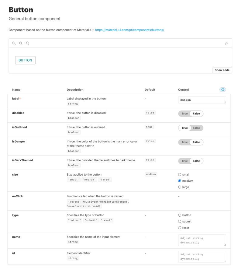
Fig 4 - Example of a docs tab on Storybook
In conclusion, storybook and this nesting logic to organize and centralize the components as the lego pieces that make up frontend projects is helping us coordinate frontend development. Although we see a lot of room for improvement in our implementation, in the long run we’ll be able to reap the full benefits of this tool. So we encourage you to keep the “it’s marathon, not a sprint” mindset when pondering your long term goals and the impact that having your own UI framework would have in your developer experience and in your company’s branding.